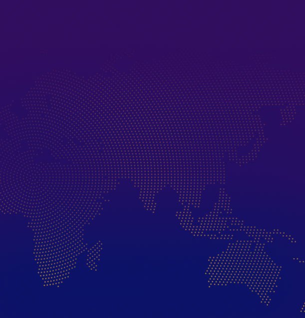
Maps are a complicated matter, and since the dawn of time, cartographers have depicted the world through subjective lenses. A recent report says that tech-giant Google may be doing the same with its popular maps service, which seems to undersell Africa’s true size (pictured above) and scope in relation to North America and other countries.
SEE ALSO: Cameroon’s Female Judges Discuss Gender-Based Violence


In an in-depth piece, Think Africa Press details the history of European cartography, stating that Europeans used maps to reinforce their colonialist views:
“These maps of Africa, drawn up by a small group of Western cartographers, symbolically reinforced Europeans’ sense of control over their mapped territories and subjects, but they didn’t betray much in the way of real information. Though they would have been seen as objective and impartial at the time, in retrospect it is clear how subjective, ideologically-driven, and, in many ways, fantastical they were.”
The future colonialists of Africa even used their maps to color in the parts of Africa they were looking to dominate.
Think Africa Press reports:
In fact, even at the 1885 Berlin Conference where, legend has it, Europe’s colonial powers each drew lines across a map of Africa and coloured in their territories with their imperial hue-of-choice, the colonialists weren’t really sure what those areas contained. Although cartographers had given up their predilection for doodling odd creatures across Africa’s interior, there wasn’t a whole lot more they could put there instead.
The publication also alleges that with all of the maps in existence, including what Google has developed, none are free of personal and perhaps financial bias.
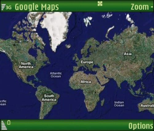
For example, the Mercator Projection, perhaps one of the most common ways to see the world, has been blasted for its inaccuracies, because it makes North America appear as if it is about the same size as Africa.
Think Africa Press reports:
For instance, in the Mercator projection (below), North America looks at least as big, if not slightly larger, than Africa. And Greenland also looks of comparable size. But in reality, Africa eclipses both. As is apparent in the Gall-Peters equal projection map (below), you can fit North America into Africa and still have space for India, Argentina, Tunisia and some left over. Greenland meanwhile is one-fourteenth the size of the continent.

Still, other maps, such as the Gail-Peters Project (pictured below), claim they get features, such as size and scope, right, and while it certainly corrects the Mercator’s size issues, there’s one detail most people miss: it is a bit tricky to make an accurate map from using Earth’s spherical shape.

So where does this leave Google? One would think that the company would have the most-sophisticated, size-accurate map in the world but even they have yet to make an objective map. Satellites have rendered older maps obsolete and the mystery of the size of countries has been brought to reality.
Still, author and cartography historian Jerry Brotton argues that even Google — who has the most widely used map app in the world — isn’t exempt from fudging the numbers:
“Mapmakers have always claimed objectivity,” Brotton explains, “and cartographers always imagine they’re creating maps from some omniscient Godlike position. When it comes to Google Maps, however, the reality is that they’re being produced on the west coast of America.”
Brotton says that Google Maps and its incomplete portrayal of the continent of Africa could be a matter of financially motivated corporate interests. Money, it seems, or financial standing may play a role in how mapping is carried out.
“It is telling that some townships in South Africa are just blank spaces on the map,” Brotton adds. “In Google’s corporate model, certain communities just aren’t of any interest. Mapping is becoming privatised, not even states have the vast resources necessary to compete, and inevitably the usual problem is that Africa comes very low down on the pecking order.”
Essentially unless Google makes its map-making data available to African people to accurately display what differs on the ground than what is seen from orbit, it will be impossible to have the “perfect map” the company claims it wants.
SEE ALSO: Update: No Ebola Case in Ghana